
Great British Railways Unveils New Branding: A Step Towards National Rail Reform
The unveiling of Great British Railways' new branding marks a significant moment in the UK's railway history. This trend digest explores how this development is intertwined with broader rail reforms and nationalisation debates, as reported by various news outlets.
Branding and logo for Great British Railways unveiled
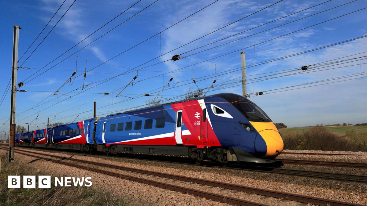
The BBC reports on the launch of the new logo for Great British Railways, highlighting its modern design and symbolic nod to the past. The branding is part of a larger effort to unify the UK's fragmented rail services under a single banner. This move is seen as a step towards simplifying the rail network for passengers and improving service delivery.
'Striking' new artwork for UK trains revealed - as MPs debate rail nationalisation
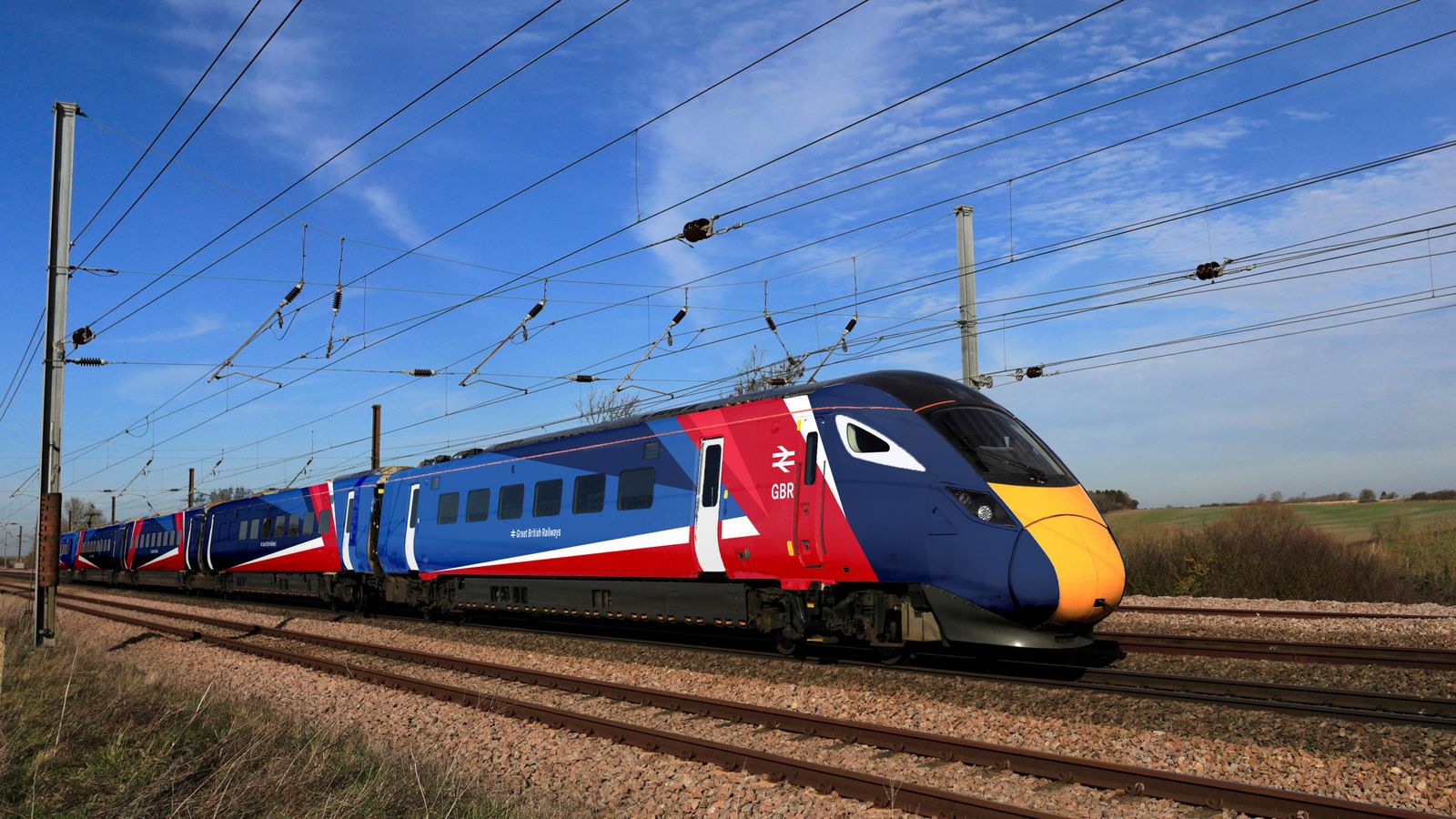
Sky News discusses the new artwork for UK trains as part of the rebranding. The article delves into the ongoing debate in Parliament regarding the nationalisation of the railways. The rebranding is positioned as a potential precursor to broader structural changes, with some MPs arguing it paves the way for improved public ownership models.
All change: The future of British trains arrives as government reforms broken railways
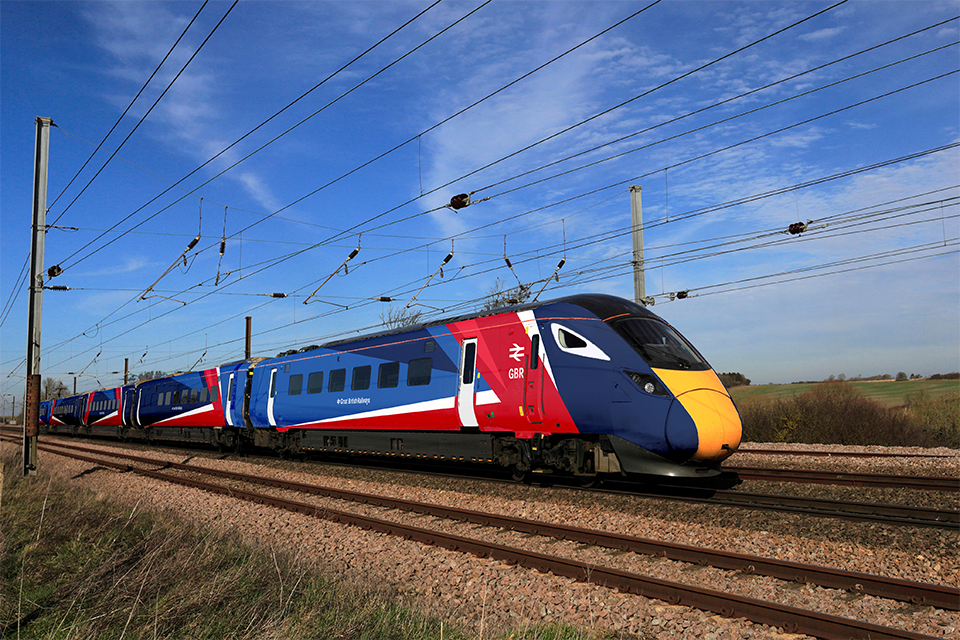
The official government perspective on the rebranding is detailed in this release, which positions it as a cornerstone of comprehensive rail reforms. The initiative aims to address longstanding issues within the rail network, focusing on management efficiencies and customer service improvements. This move is part of a broader strategy to revitalise public transport.
Train livery revealed for Great British Railways

RailAdvent provides an in-depth look at the new train livery, emphasizing its blend of contemporary aesthetics with traditional British rail colors. This design choice is intended to evoke a sense of national pride and continuity. The article suggests that the livery is not just a cosmetic update but part of a significant evolution in British rail travel.
Great British Railways flies the flag as logo goes back to the future
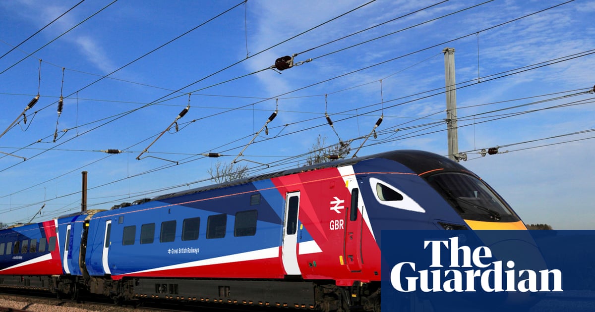
The Guardian examines the nostalgic elements of the new branding, noting its homage to the golden era of British railways. The article provides historical context, comparing the current rebranding effort with past initiatives aimed at unifying and improving the rail service. This perspective underscores the cyclical nature of branding in public transport.
New look for trains all over the country unveiled as rail is nationalised

The Manchester Evening News focuses on the nationwide rollout of the new train designs, highlighting public reactions and the implications of nationalisation. The coverage suggests that while the branding is visually appealing, the success of these changes will depend on improvements in service reliability and customer satisfaction.
Government should grasp the opportunities around rail reform

Politics Home presents an analysis of the political and economic opportunities presented by the rail reforms. The commentary argues that the rebranding should be leveraged as a catalyst for broader reforms and innovations in the rail sector. It suggests that the government must maintain momentum to ensure these changes lead to tangible benefits.
Branding for Great British Railways revealed

The i Paper covers the branding reveal with a focus on its potential impact on public perception and passenger experience. The article suggests that the branding is a strategic move to enhance the image of public transport, seeking to attract more commuters and reduce dependency on cars.
Summary / Insights
The introduction of new branding for Great British Railways is more than a visual update; it's a pivotal element in the ongoing rail reform efforts. While the aesthetic changes have been largely praised, the real test will be in operational improvements and public reception. The discussions around nationalisation and reform highlight the complexities of modernising a historic institution.

Resources
Sources and references cited in this article.