
Times New Roman vs. Calibri: The Font Battle in US State Department
The recent decision by the US State Department to revert from Calibri to Times New Roman has sparked widespread discussion. This change, framed as a move against 'wasteful' diversity, has garnered attention from various media outlets, highlighting different aspects of the decision's political and cultural implications. This trend digest explores the timeline and narratives presented by various news sources.
Main Topic Overview
In a striking move, the US State Department announced a switch back to Times New Roman from Calibri, citing efficiency and traditional values. The decision has been interpreted by many as a symbolic stand against what some officials have labeled as 'woke' culture. This change has ignited debates about the role of style and tradition in government communications.
Font of ‘wasteful’ diversity: Trump’s state department orders return to Times New Roman
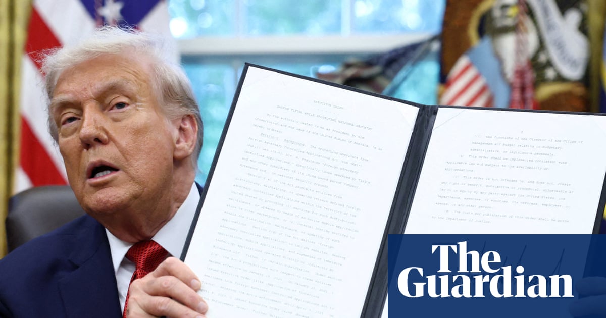
The Guardian reports that the US State Department's font change is being seen as a political statement against diversity and inclusivity. The decision, initiated during Trump's administration, is viewed by critics as an attempt to reinforce traditional norms under the guise of practicality. This move has sparked debates on whether font choice holds deeper cultural significance in government messaging.
Marco Rubio orders diplomats to stop using ‘wasteful’ font

According to The Times, Senator Marco Rubio has been a vocal advocate for the font change, labeling Calibri as 'wasteful.' His stance reflects a broader conservative push against modern trends perceived as unnecessary or overly progressive. The article details how this font debate symbolizes larger ideological battles within the US government, illustrating the tension between tradition and modernity.
US State Department changes official font in latest anti-diversity move

The BBC highlights the contentious nature of the font change, emphasizing its reception as an anti-diversity move. The piece explores how such administrative decisions can have broader cultural implications, potentially influencing public perception of governmental priorities. This shift is part of a series of actions by officials to reassert more traditionalist policies.
Font and Center: State Department brings back Times New Roman to fight the war on ‘woke’
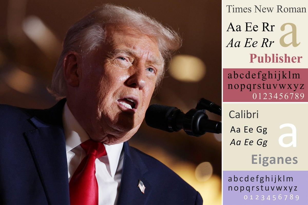
The Independent delves into the symbolic implications of the font change, characterizing it as a cultural stance against 'woke' ideologies. This article articulates how the choice of font has transcended aesthetics, becoming a battleground for ideological expression in the US political landscape. The narrative suggests that such changes are reflective of broader governmental strategies to emphasize traditional values.
US State Department to revert to Times New Roman font over 'wasteful' Calibri
The Australian Broadcasting Corporation reports on the logistical reasons cited by the State Department for the font switch, labeling Calibri as inefficient and costly. The article provides insight into the administrative reasoning behind the change, highlighting a desire for standardization and perceived cost savings, while also acknowledging the broader cultural and political debates it has incited.
Early Addition: The State Department's war on inclusive fonts

Gothamist frames the font change as part of a broader 'war' against inclusivity within the State Department. The article presents arguments about how font choices can reflect underlying biases and cultural preferences, suggesting that such changes are not merely aesthetic but also ideological. This perspective adds depth to the understanding of how administrative decisions can be perceived through different lenses.
Font of Wisdom

The National Review offers a conservative viewpoint on the font switch, praising the return to Times New Roman as a reaffirmation of traditional values. The article discusses how fonts can embody cultural and historical significance, suggesting that the change is part of a larger effort to maintain consistency and heritage within government communications. This perspective highlights the symbolic weight given to seemingly minor administrative changes.
Summary / Insights
The coverage of the US State Department's font change reveals a complex interplay between style, politics, and culture. While some view it as a practical decision, others see it as a symbol of ideological resistance to modern inclusivity trends. The broader narrative reflects ongoing tensions between traditionalism and progressivism in American governance. As the debate continues, it is clear that such administrative choices can have far-reaching implications beyond their immediate context.

Resources
Sources and references cited in this article.